
")
")
")
")
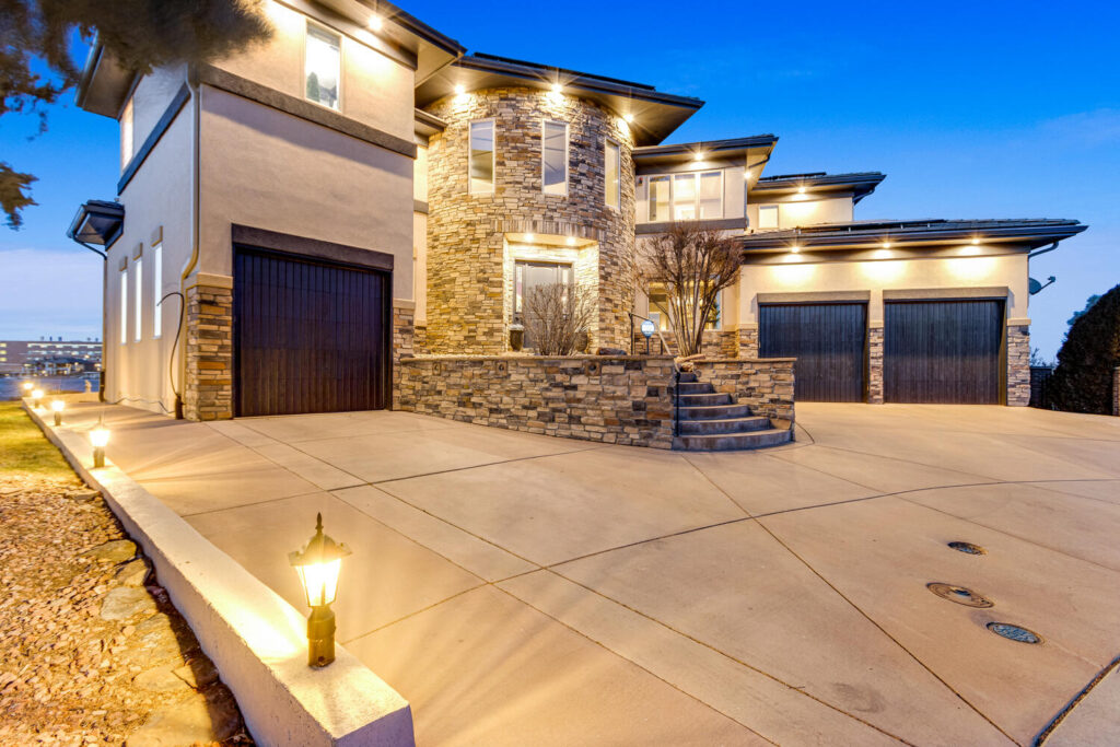
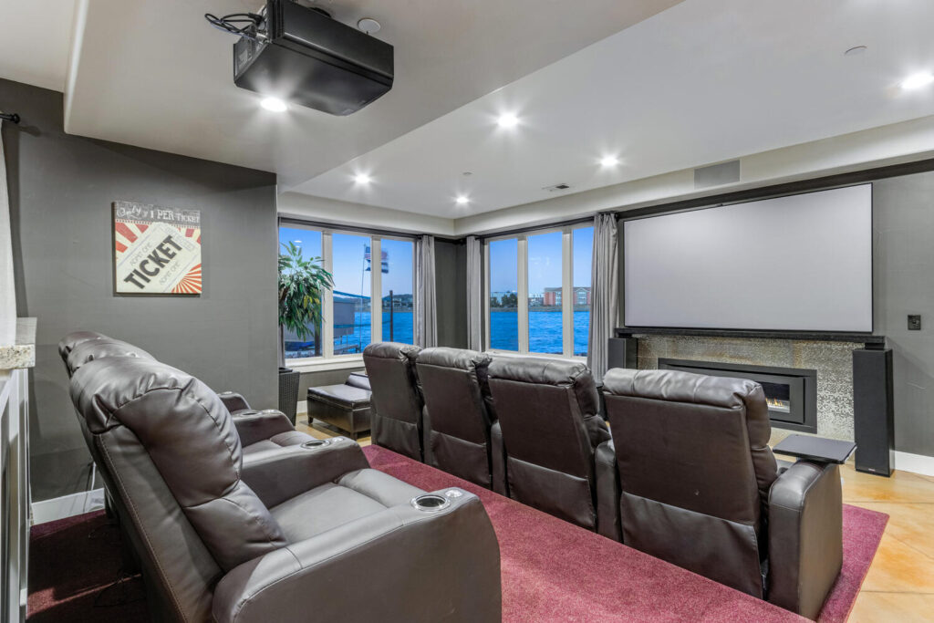
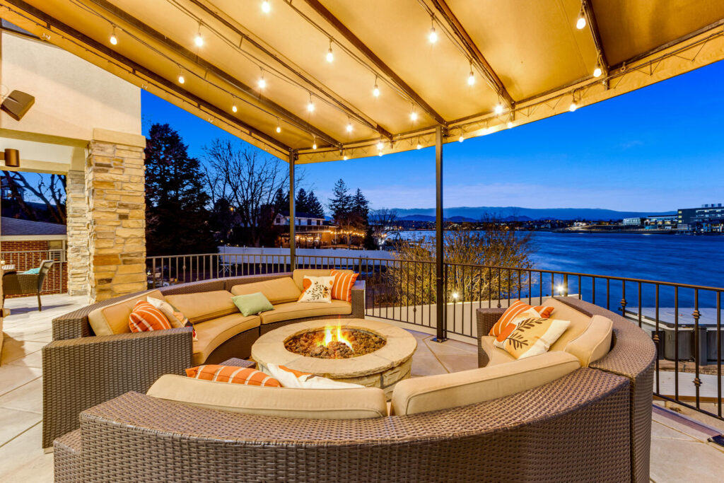
If your goal is to take beautiful real estate photos, there will no doubt be many, many areas of research involved in trying to figure out just how to do this. Which camera would be best? When are the ideal lighting conditions? And what about those tricky interior shots? We’ll discuss all of these in our blog. But there is one, often overlooked but crucial, decision to make. Once you have taken your photos, what are you going to do about editing them? Here are a few of our thoughts on how to get the most out of photos.
There are a few different options available when it comes to photo editing software. Undoubtedly, we believe that Adobe Lightroom is the best choice for real estate photographers or, for that matter, anyone looking to produce high quality images. Other programs like Photoshop has a famous name, and a vast toolbox full of ways to change the content of your photo. But if you are not interested in removing cars from the driveway or artwork from the walls, and you simply want to boost the saturation, add contrast, or make your colors pop a bit more, Lightroom will be a great choice. If you are new to the suite of Adobe products, you’ll have one important decision to make before you get started. Which version of Lightroom to choose?
Lightroom Classic vs Lightroom CC
There are two versions of Lightroom to choose from: Lightroom Classic or Lightroom CC (Creative Cloud), sometimes referred to as simply ‘Lightroom’. This is not a clear case of one being superior to the other. Both versions work great. The choice will be based on how and where you prefer to work, and whether you prioritize full-control of your editing process as opposed to speed and convenience. When Adobe released their first Creative Cloud applications in 2013, they knew that apps designed for all devices, not only desktop computers, would be crucial to their success.
If you are a beginner or amateur photographer, Lightroom CC may be the best fit. One of the primary benefits of this version is that it is designed to work on a mobile device, tablet or desktop computer. It is built to be efficient and easy to understand. Since it is designed to work on touchscreens, sliders controlling brightness, contrast, saturation and many other advanced features are large enough to easily see and manipulate. Since your original files are stores in the cloud, you can access your settings or final images from anywhere. Lightroom CC also makes it simple to post your images to social media, and automatically backs up your files. You can download the Lightroom Mobile App for quick and easy access.
The downside of Lightroom CC is that it is less comprehensive than the traditional Lightroom Classic releases. In an effort to maintain simplicity and ease of use, Lightroom CC may be missing some of the more advanced or nuanced features that you’re used to, if your priority is creating the highest quality image. It is more difficult to maintain specific control of your settings when working on a touchscreen, especially on a smaller phone screen, than if you were using a desktop computer with a mouse.
Lightroom Classic is the more traditional and more comprehensive version of the program. Don’t let the name fool you, Adobe offers frequent updates and the software is quite advanced. Lightroom classic includes dozens of different editing tools. While there may be a steeper learning curve, everything you’ll need to create professional-looking images is included. You can also export your images directly into Photoshop, if you do need to make more in-depth changes. We think Lightroom Classic (Desktop Version) is a great option for creating high-quality images. It is what we use for our own editing, and it’s the program we will be referring to as we describe some of our favorite editing settings and techniques.
Pro-tip: Instead of subscribing to the full Adobe suite, save some money with the Adobe Creative Cloud Photography Plan. It does not include any of the graphic design or illustration apps, but it includes both Lightroom CC and Classic, as well as both Photoshop and Photoshop Express (Photoshop’s desktop vs mobile apps). Great for photographers!
Lightroom Settings
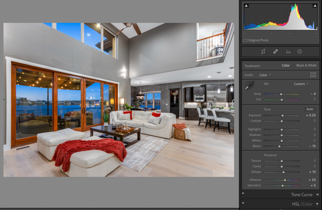
While it is important to work hard and try to create appealing real estate images while you are on-site at the property, you will almost certainly be able to improve them with even a quick round of Lightroom edits. We recommend importing all of your interior photos and exterior photos into Lightroom. Based on some of our recommendations, as well as your preferences, you can save many of these settings as a preset, which can be applied to your photos later. Lightroom includes a preset collection that you can peruse, but we believe that some more subtle adjustments can be effective to create a professional look.
The first step in our editing process is to import and organize all images. Then separate the interior photos from the exterior photos, and group all images of the same room together, so that once you have found the settings that make the room look it’s best, you can easily copy those settings to the other angles of that room. Adjusting the white balance and exposure is typically the next step. A slight adjustment of temperature and tint sliders can make a huge difference. Watch certain objects in the room that are actually white in reality (Often a door frame or electrical outlet). If they appear white, you are on the right track. You can also use the white balance selector (It looks like an eye-dropper next to the white balance sliders). Click on something in the room that was white, and Lightroom will automatically adjust the white balance of the image to attempt to make that white appear neutral. You can always use that as a starting point, and manually adjust from there. Once you have found a white balance that looks neutral, feel free to copy it to other angles of that same room. Be careful, though. Images of different rooms may have different white balances. If a room has more natural light, it will appear slightly cooler. If it has more artificial light, it will appear warmer. Repeat this process for each individual area with different lighting conditions.
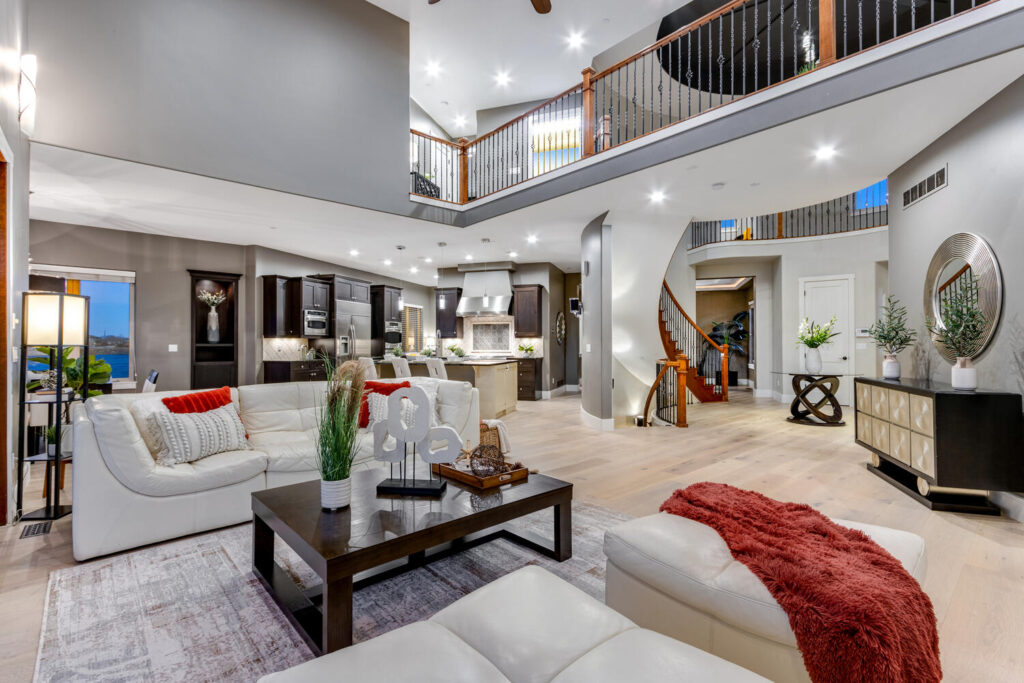
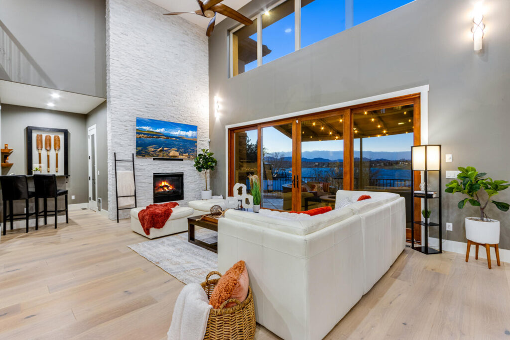
Next, You’ll want to adjust your exposure. This is fairly straightforward. We recommend a boost of exposure to any of your interior images. A bright property appears more open and inviting. As you increase your exposure, you will likely want to boost your contrast as well. Keeping dark, rich, black tones in a photo absolutely help it look professional. This is dependent on the individual photographers’ preference, though. Lighter shadows and less contrast will give the interior space a softer and more airy look. Great for sunny spaces filled with natural light. High contrast and deep blacks in the dark areas will give the interior space a more dramatic look. Great for interior spaces photographed on cloudy days or at twilight. The contrast slider is a useful tool, but we often prefer to use the Dehaze slider. It is similar, but can really help fill in the shadows or black areas nicely without blowing out the highlights. For exterior photos, only slight adjustments may be needed. If your timing was good during the shoot, you took advantage of golden hour, or the exterior space is well lit, you may not need to make many adjustments at all. Exterior shots can often benefit from from a simple boost in vibrant colors. We like to use the vibrance slider, as opposed to the saturation slider. It usually looks a bit more realistic.
For extremely specific color editing, the Color Grading tool is a great way to achieve your perfect look. But for a more time-efficient route, each color has a slider built in for saturation, luminance and hue. We often slightly decrease the yellow saturation for interior pictures, to help achieve a more neutral look. We also frequently decrease the blue luminance slider for twilight photos, in order to help give the twilight sky a vivid and dramatically unique look. Deeper blues often look stunning at twilight.
Here are a few more helpful tools that we often use to help achieve the best results. The noise reduction tool is a great help when your photos were taken in low light. This will drastically reduce the amount of noise or graininess in the shadows of these images. If you are a photographer using an auto-exposure bracketing method (HDR Photography), you may want to take advantage of the Defringe sliders. Once your exposures are combined into one image, you may see an HDR effect from the exposure blending in areas of high contrast, often along the edges of windows. They may appear as pink or green lines bordering the window. Increasing the amount of Defringing applied can help minimize these effects.
Don’t forget to straighten the vertical lines. The Vertical Transform tool can automatically straighten all of your vertical lines with one simple click. This makes a huge difference in the overall high-quality feel of your image by improving the composition. Finally, for those close-up detail shots, consider using the Post Crop Vignetting slider, under the Effects section. This will create a subtle vignette, either light or dark depending on your preference, around the edges of your image. This helps draw attention to the center of the photo. Especially if it’s a sharp detailed shot, this will create an artistic feel, and help the whole gallery stand out as a truly professional product.
Hopefully this is helpful! Please visit our About Us page HERE to learn more about us, and continue to check out our Blog page for more helpful tips and lists throughout the year!
View comments
+ Leave a comment